Good UI design should make the next action obvious.
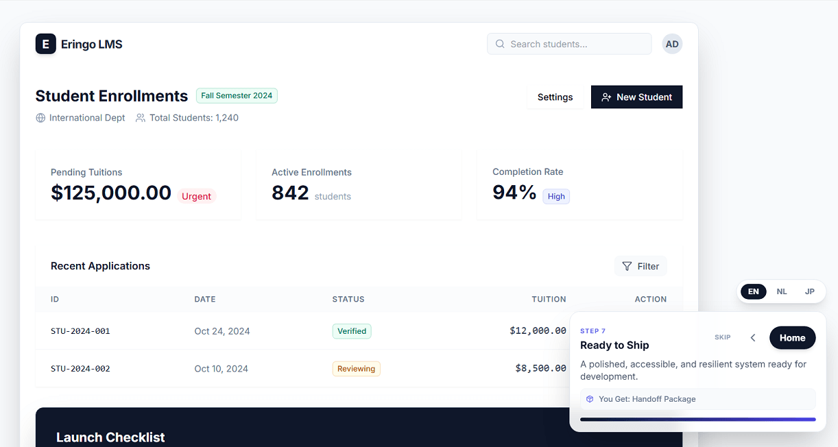
That is the idea behind my latest interface study: a screen system focused on clarity, hierarchy, and calm interaction instead of visual noise. Rather than filling the page with controls or nice graphics, I shape the layout so users can understand where they are, what matters, and what to do next.
You can view my process here: Open the UI design demo
What I focus on
1) Strong visual hierarchy
The most important information needs to stand out immediately. I use spacing, contrast, and typography to guide attention before a user has to think about it.
2) Screens that feel calm
A busy interface creates hesitation. In this demo, I reduce visual clutter and give each section enough room so the content feels easier to scan.
3) Natural task flow
Users should not have to decode the interface. Groups, actions, and supporting details are placed in a way that supports a logical reading order and smoother decisions.
4) Modern but practical styling
I like interfaces that feel current without becoming fragile. The goal is not decoration for its own sake, but a design language that supports usability.
Why this matters
When a UI is easy to read, people make fewer mistakes and move faster. That matters for internal dashboards, customer portals, booking flows, admin screens, and almost any product where people need to complete real tasks.
For me, good interface design is not about adding more. It is about deciding what deserves attention and removing what gets in the way.
If you want to see that approach in practice, take a look at the demo: demo/ui_design/index.html