Japanese websites are often packed with information, making them difficult to understand for people from different backgrounds or those who are less digitally savvy.
My priority is a design that 'delivers only the essential information, without the user getting lost'. I organize the chaos and make it usable for everyone.
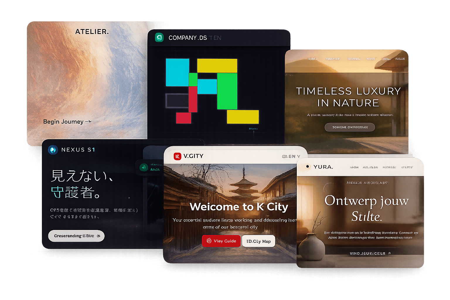
I like websites that don't get in the way. Here are the simple rules I follow.
1) Structure first, then design
Determining the heading hierarchy, whitespace, and reading order. A strong foundation can handle theme changes and content additions.
Why? A complex structure frustrates the administrator. I build simple paths so that anyone can update it, even without technical knowledge.
2) Text is the main character
Most pages consist of text. Calm typography, short sentences, and sufficient contrast are most effective.
Why? Readable text communicates better than a flashy design. To break through the 'wall of information', it's crucial to cut unnecessary decoration.
3) Multilingual from the start
I design with English/Japanese/Dutch and potentially other languages in mind: short labels, room for text expansion, and no text in images.
Why? Adding multilingual support later breaks the layout and inflates translation costs. By accounting for it from the beginning, the site lasts longer.
4) Readable dark/light mode
Color management via CSS variables and checking both themes manually. I avoid 'flickering' colors.
Why? A site that adapts to the user's preference is accessible. It's part of 'Universal Design'.
5) Stack small automations
Building systems for PDF generation or data import to reduce manual work.
Why? Solving 'time-consuming, repetitive tasks' reduces the burden on administrators and ensures a site is used longer and better.
If your site feels heavy or is hard to manage
My advice is to start with the basics: simple HTML, clear language, and few distractions.
- Don't use unnecessary frameworks
- Limit yourself to the essential information
- Design from the administrator's perspective
The result may not be flashy, but it is sustainable and usable.
Recent example
Recently, my 'simple and clear' design was appreciated, and I received a one-year contract. The main requirement: 'a design that even people without technical knowledge can immediately understand and use'.
Removing the 'wall of information' and building a site that everyone can use. That is my web design.
If you are considering improving or rebuilding your site, feel free to get in touch. We can then think together about the most 'usable' form.