Color systems become more useful when they connect meaning with implementation.
I added a new demo for exploring Japanese traditional colors with OKLCH. It turns ideas like restrained saturation, layered surfaces, seasonal color motifs, and material-inspired color names into UI tokens that can be adjusted directly in the browser.
Open the demo here: Japanese Colors OKLCH demo
This demo grew out of something I personally enjoy: looking at Japanese design and trying to understand why certain colors feel so calm, balanced, and expressive at the same time. In textiles, packaging, signage, sweets, ceramics, gardens, and everyday printed materials, the colors are often not loud — but they still carry a very clear atmosphere.
While looking more closely at Japanese traditional color theory, I kept coming back to a practical lesson for interface design: color does not always need to become stronger to become more useful.
Sometimes the better answer is a smaller lightness step, a softer chroma value, or a palette where the background, border, surface, and action color all feel related.
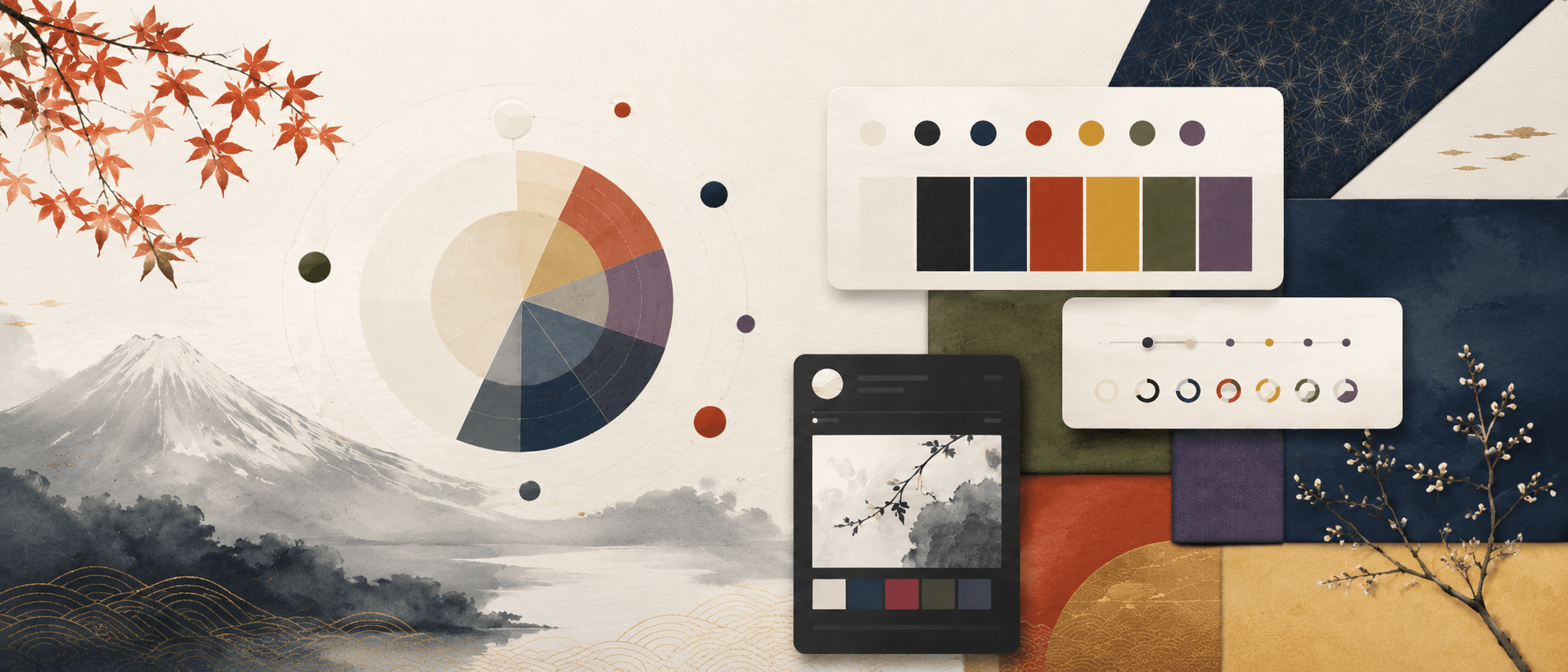
What the demo shows
The playground lets you switch between a light 白練-inspired theme and a dark 墨-inspired theme. From there, you can adjust hue, chroma, and lightness steps. The preview updates immediately, so you can see how a palette affects surfaces, buttons, borders, readable text, and semantic status colors.
That immediate feedback was important to me. I did not want the page to be only a moodboard of beautiful colors. I wanted it to show how those colors behave inside an actual interface system.
The demo also includes a compact color library with 24 traditional colors. You can search by kanji or romaji, filter by color family, and copy the OKLCH value from each color card.
Why OKLCH
OKLCH separates lightness, chroma, and hue. That makes it easier to keep contrast readable, build calmer UI layers, and avoid guessing every color value by hand.
For example, if a palette feels too sharp, you can reduce chroma without completely changing the hue. If the interface feels flat, you can increase the lightness step between surfaces. If status colors feel too harsh, you can keep the semantic hue but bring the color back into the same visual rhythm as the rest of the UI.
That is the part I find exciting: Japanese color ideas can stay meaningful, but they also become adjustable, testable, and reusable in real design work.
This demo is not meant to be a complete historical reference. It is a small design experiment — part cultural curiosity, part color study, part practical UI-token playground.
The demo follows the user's browser language when it is Dutch, Japanese, or English. Other languages fall back to English.